Batch Comparison
compare_batches can be used to determine: did code or parameter changes make
trajectory sims better, worse, or different?
Use two existing batches — A (baseline, “before”) and B (experiment, “after”) — to produce an HTML report with per-launch metric deltas, aggregates by forecast type and campaign, win/loss counts, and overview bar + scatter plots for every metric. This builds on Batch Evaluation: which runs a batch on the current codebase.
Note
The comparison is pairwise — exactly A vs B, not N-way. The sign convention is Δ = B − A, and every metric is a magnitude of error, so negative Δ means improvement (and is colored green).
Running a comparison
PYTHONPATH=src python -m evaluation.compare_batches <batch_A> <batch_B>
Both arguments accept either a full batch_id or just the short git hash:
# full batch IDs
python -m evaluation.compare_batches \
    2026-05-21T1510_96bcc3f \
    2026-05-21T1526_96bcc3f

# short hashes (ambiguous hashes will error out)
python -m evaluation.compare_batches 96bcc3f 4afc699
Self-comparison (compare_batches X X) is allowed and useful as a
sanity check — every delta should be zero.
Comparison output folder
Each comparison writes a self-contained folder next to batches/:
evaluation/comparisons/
└── 2026-05-21T2004_96bcc3f_vs_96bcc3f/
    ├── compare.html                                ← the report
    ├── plot_landing_distance_km_GFS_bar.png        ← per-launch Δ bar chart
    ├── plot_landing_distance_km_GFS_scatter.png    ← A-vs-B scatter
    ├── plot_landing_distance_km_ERA5_bar.png
    ├── plot_landing_distance_km_ERA5_scatter.png
    ├── plot_landing_time_diff_min_GFS_bar.png
    ├── ...                                         ← ~40 plots total
Two PNGs per metric per forecast type. The HTML embeds the plots by relative path so the folder is portable.
HTML report
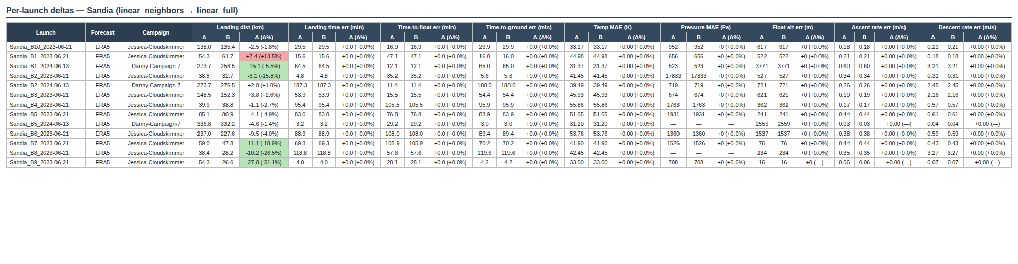
The example below is the per-launch detail table from the linear_neighbors → linear_full
comparison, filtered to the Sandia launches. Each metric occupies three sub-cells
(A | B | Δ), and Δ cells are colored only when the change clears both the
absolute and percent thresholds — green for improvement, red for regression,
gray for “within noise”. Metrics that don’t depend on wind interpolation
(time-to-float, temp MAE, ascent rate, etc.) stay at “+0.0 (+0.0%)” across the
board, which is itself a useful sanity check.
The report opens with a summary block — 5–7 lines covering the headline metrics (landing distance, landing time error, float altitude error) to see whether the change helped or hurt.
Below the summary:
ASYMMETRIES section — launches present in only one batch, or that failed in one but succeeded in the other. These are listed separately so they cannot quietly skew aggregate metrics.
Overall summary — mean(A) | mean(B) | Δ | Δ% per metric across the intersection of both batches, plus a win/loss count line per metric (e.g. “28 improved / 5 unchanged / 13 worse”).
Per-forecast aggregates — same layout broken out by GFS and ERA5.
Per-campaign aggregates — one block per campaign that appears in both batches.
Per-launch detail table — three sub-cells per metric (
A | B | Δ), colored by improvement direction.Reforecast diagnostics (GFS only) — a separate section for the
reforecast_landing_dist_mmetric, which isolates wind-forecast error from altitude-model error.
A cell is only colored if both |Δ| > metric_abs_floor and
|Δ%| > 5%. Cells below either threshold stay gray — this avoids
calling tiny noise an “improvement”. Per-metric absolute floors are
defined as constants at the top of evaluation/compare_batches.py.
Overview plots
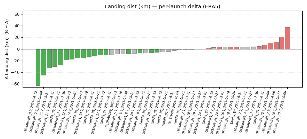
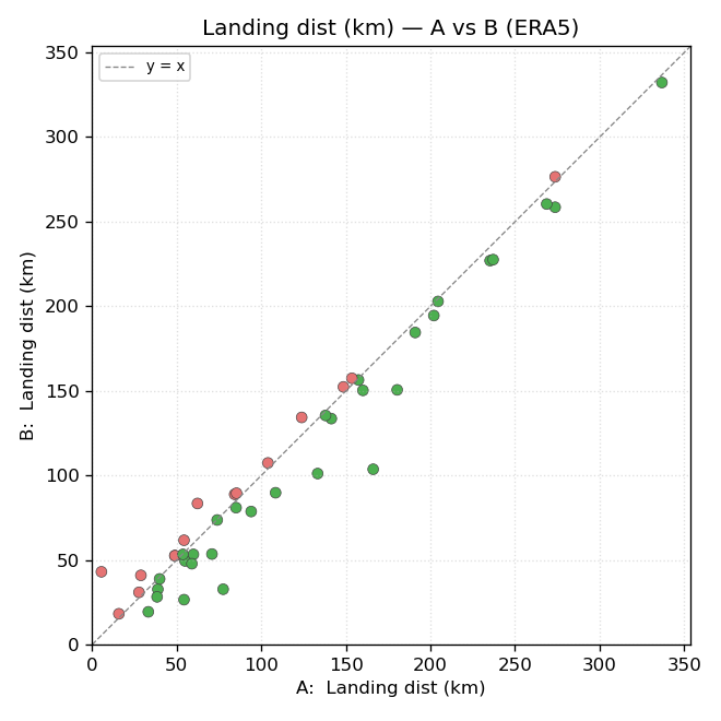
For each of the comparison’s metrics, two plots are generated per forecast type:
a per-launch bar chart of signed Δ (B − A), sorted by Δ, and
an A-vs-B scatter with a y=x reference line.
Both use the same green / gray / red color convention as the HTML cells. The bar-chart Y-axis is shared between the GFS and ERA5 versions of the same metric, so you can flip between them and directly compare scale.
The example below is from the 46-launch comparison of the historical
linear_neighbors wind-interpolation method (A) against the new
linear_full method (B) introduced in v1.4. See
Wind Interpolation Methods for what those methods are.
Per-launch Δ bar chart — landing distance, ERA5:
A-vs-B scatter — same metric, same forecast:
Asymmetries
A launch may be missing from one side for several reasons:
It was added (or removed) from
launches.jsonbetween the two batch runs.One run failed for that launch (network error, missing forecast file, evaluator exception) while the other succeeded.
The launch has both GFS and ERA5 in one batch but only one of them in the other.
These cases are split out into a top-level ASYMMETRIES block and excluded from the intersection-based aggregates, so the headline “mean Δ” numbers stay apples-to-apples. The asymmetry block lists the affected launches with the reason for each.
Schema drift — a metric column that exists in one batch but not the other — is silently dropped from the comparison with a warning banner at the top of the HTML.